


152d 16h
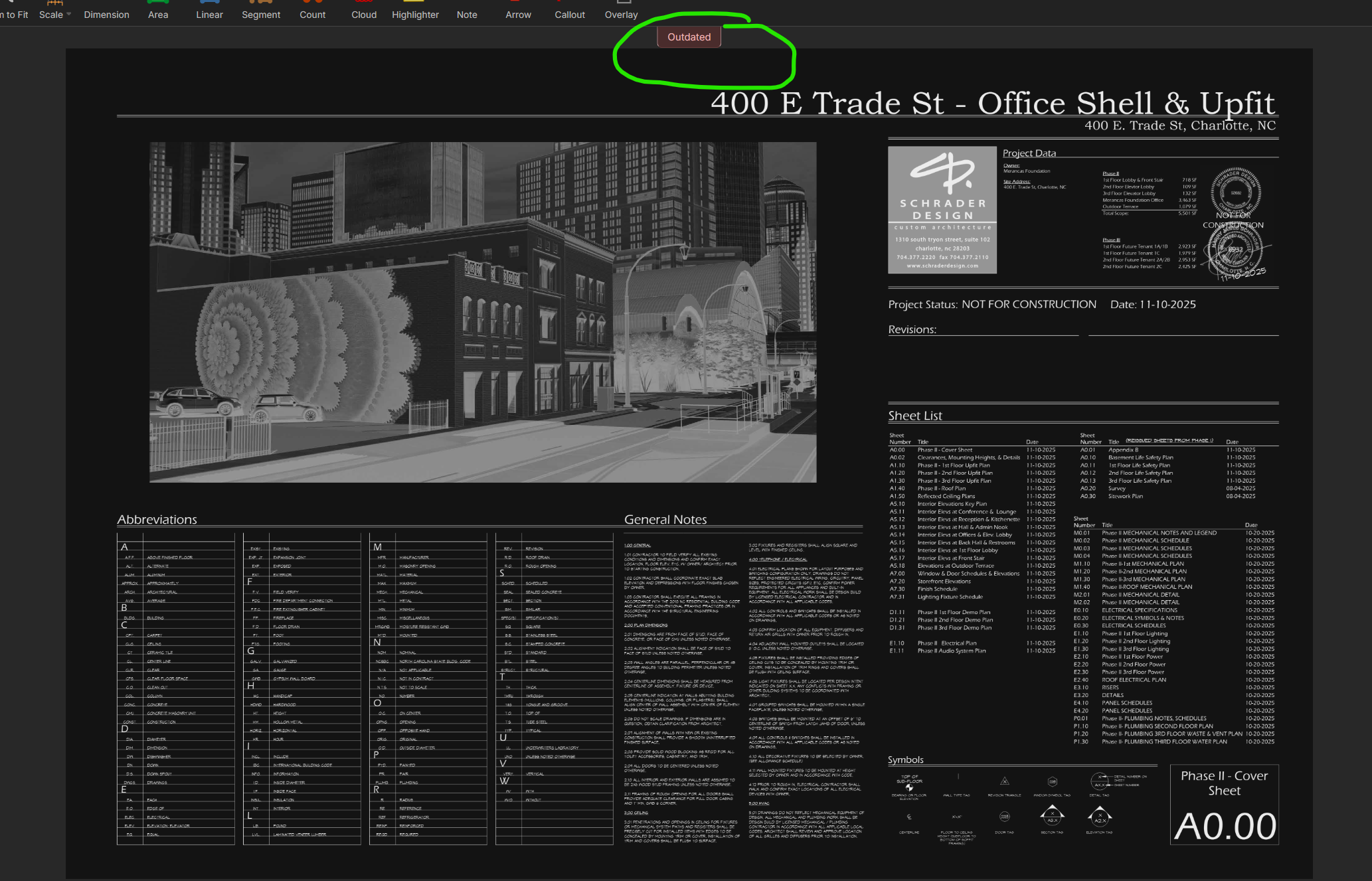
Increase visability of "Outdated" marker
Under Review
Can this be made larger or possibly a watermark across the outdated page?
2

Chaz Prichard 152d 16h
Or also "CURRENT" shaded with green, if not already (haven't had a chance to check it out yet - hopefully in the weeks to come)
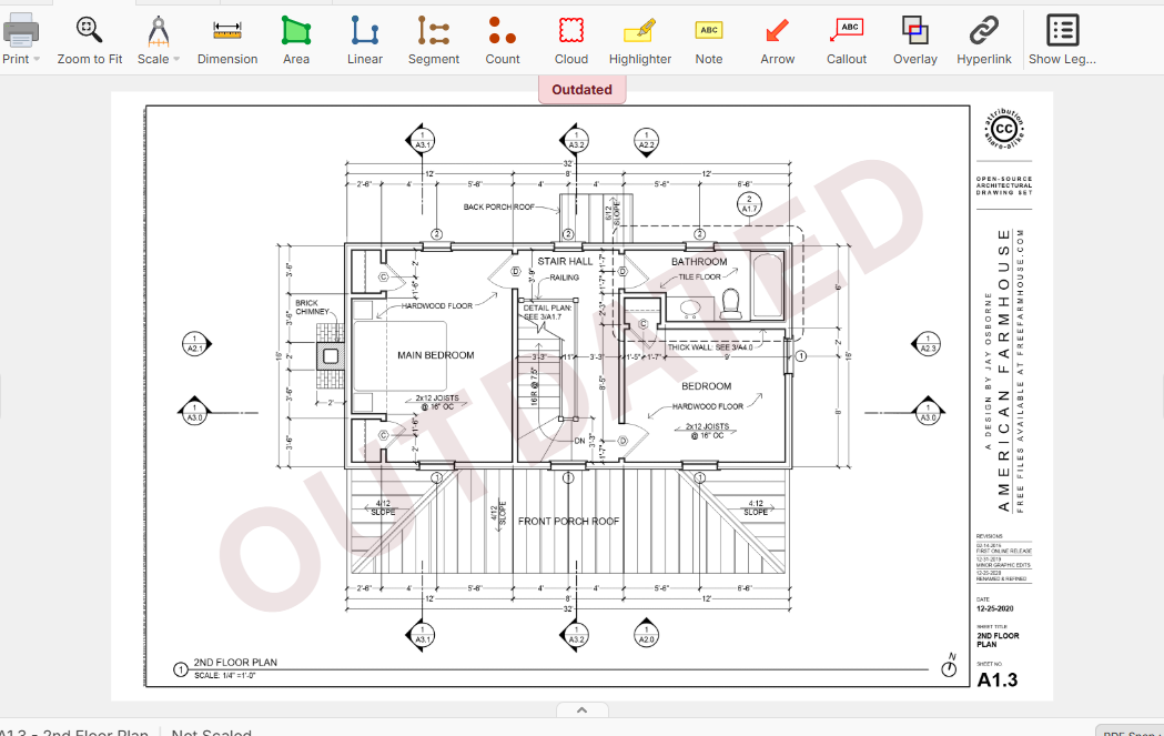
Heber Allred zzTakeoff151d 11h
Maybe something like this so it's more obvious? Would this be problematic / in the way?

Kory Podgaysky 151d 11h
I like it.
Chaz Prichard 151d 11h
@heber perfect!
You must be logged in to post replies. If you don't have an account you can signup here.