











Toolbar Diet: Fewer Buttons, More Takeoff
Hi zzTakeoff team,
Our Takeoff toolbar has too many not useful buttons (Plus they are way to big). Two asks:
1. Grouped buttons
- One Measure button for Area, Linear, Segment and Count.
- One Markup button for Callout, Arrow, Note, Cloud, Highlighter and the rest.
- Each opens a small flyout right under it, with an icon on every item and the hotkey shown on hover.
- Picking an item works exactly like today’s button: same New Area box and Start Takeoff flow.
2. Let us set up the toolbar
- Show, hide and reorder the built-in buttons.
- A compact, icons-only size like the Reports toolbar already uses.
Why it can’t be a plugin: we tried. Plugins can’t hide built-in buttons or open the New Area box, so this needs to be built into zzTakeoff.
Thanks,
Kyle

Agreed. Super agreed, even.
I think there's been so many feature updates over the last year that I've used zzTakeoff that it's hard to find some of the features and I forget about them. A year ago the tool bar was good for what zzTakeoff offered then, but the tool has evolved and it's time for a tool bar refresh.
🚀1

Hey Kyle! Great idea for the grouped buttons/tools. The toolbar customization (show/hide/reorder) is a planned feature, and we could probably implement your grouped/condensed feature request at the same time.
🚀1Love it! One example is I show people the "slice tool" and they are like, where was that hiding. I just added it to the tool bar now.
🚀2
It's coming 🙂 Thanks for your patience. Lots in the works, but it will all click together with time 🚀
🚀1I second @john's request, but I think how overlay works and is interacted with could use some TLC in general. It's something I struggle with quite a bit.
🎯1
I would also like to move the Layers button next to the project as it appears on mobile (but still include the layer name). Basically anything that controls what you are looking at and how you navigate the plans should enjoy a position of primacy.
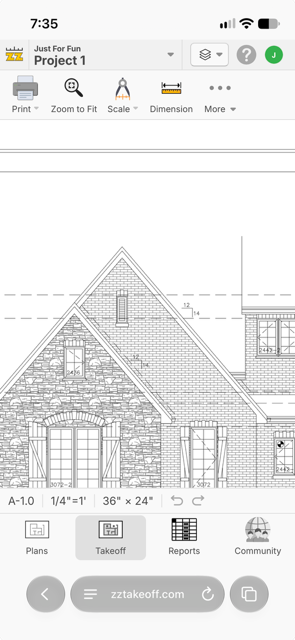
Top ribbon dream would be: Project | Layer | Page | Overlay. All as dropdowns. Then there would be almost no need for a persistent toolbar provided we learn a few hotkeys.
👍1