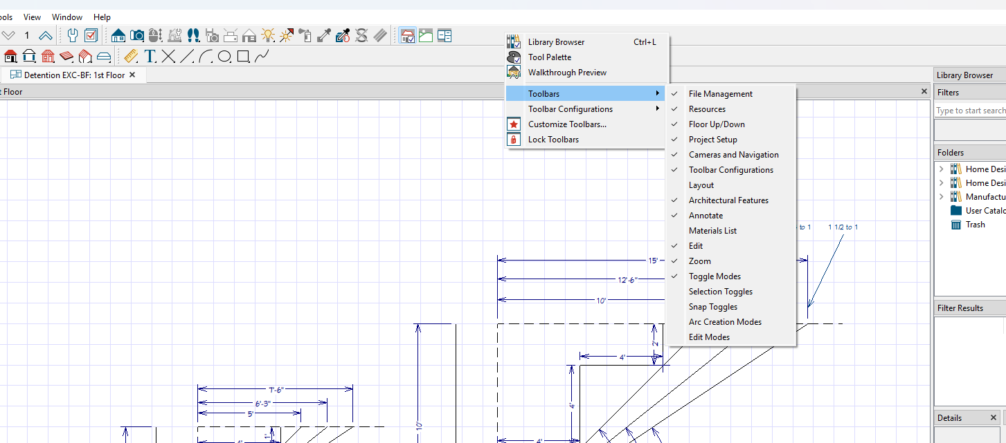
Collecting Input: Context Menu Near Selected Objects
What do you guys think if we move the context-aware toolbar buttons next to the selected objects on the page. Less mouse movement. There is a risk of it being in the way since it's hovering above the plans, but we could make it so you can click & drag it. Do you like this better and we could remove from the upper toolbar?

I like it better!
I honestly didn’t even realize those buttons existed up top. The right-click menu and keyboard shortcuts are what I use daily. Personally, I’d vote to remove the top buttons altogether..... they feel dated, like a throwback to the 90s ribbon style.
I’d actually challenge the whole top ribbon in general: how can we make this tool visually cleaner and more modern? Maybe even get a UX designer (preferably with a fresh design eye) to sketch some ideas in Figma.
For this specific case, the right-click workflow works great. Let’s remove the redundant buttons up top and avoid adding more clutter to the takeoff objects on screen.
Yes, please do it. I'd love it.

I rarely use that dynamic part of the toolbar at all. New users who don't have prior experience with PS might still need to see what the names of those icons are though, at least initially
Heber,
I have a CAD design program that allows me to choose what items are in the "tool bar" and also the ability to move them around from the top to the side or whatever. Likely you are already aware of this but thought I would post it. :) Food for thought.

I would say definitely pull off main toolbar or leave option for beginner profile users (if that's ever the way zz goes [profiles: beginner/student, takeoff, estimator, precon, etc])
I would assume most will eventually hotkey these commands anyway...


