


284d 21h
Comparative Overlays
Hello All,
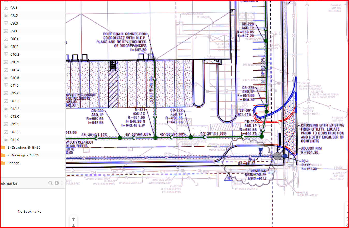
Seems like lots of people are using the overlay feature now, is anyone experiencing blurriness and an oversaturation of blue when performing the comparative overlays?
This is ok when it is major design differences, but it is very difficult to see minor changes (ex. dimensions, etc). Currently I go back to do the overlay in PS, save it as a pdf and then drop it into zz, not ideal but it works. Thoughts?
2

Jes 281d 3h
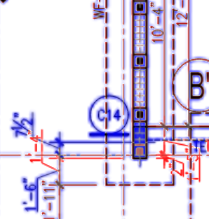
Yes there is a blurriness of the blues on my end as well
You must be logged in to post replies. If you don't have an account you can signup here.